WB × The Multiplier / Design & brand
Explainer
Why Your Print Never Matches Your Screen: Color Management for Business Owners
Your screen makes color with light. A press makes it with ink soaking into paper. Everything else in this piece follows from that.
By Weston BeckwithUpdated 8 min read
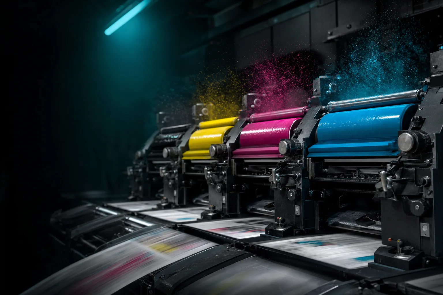
Your print does not match your screen because the two are not making the same thing. A monitor mixes red, green, and blue light, and it can show colors that no ink on any paper can reproduce. A press lays cyan, magenta, yellow, and black ink on a sheet that absorbs some of it, and the result depends on the paper, the coating, the press, and the profile the printer runs. Color management is the set of measurements and file rules that lets you predict that difference before you pay for 5,000 of something.
I built an in-house print operation at Pravada in Fort Myers from 2020 to 2025, and before that I art-directed a shop that put out 30-plus projects a day (my bio has the timeline). The complaint never changed: "it looked different on my screen." Here is what a business owner needs to know as of September 2026, and the checklist I send with every file.
What it is
There are three ways to specify a color, and they are not interchangeable.
RGB is light: screens, phones, websites, hex codes. It has the widest range of the three, which is the root of the problem. Your designer picked a blue the screen can show and the press cannot.
CMYK is process ink, cyan, magenta, yellow, and black, laid down as tiny dots in percentages. Nearly all commercial and digital printing uses it. Any color outside what those four inks can mix gets pushed to the nearest color they can, and that push is what people describe as "it went dull."
Spot color is premixed ink to a published formula, usually Pantone. As of September 2026 the Pantone Formula Guide lists 2,614 spot colors and costs $248; the CMYK simulations are a separate $219 guide, because a spot color and its four-ink approximation are different things. Spot color is what makes a brand orange the same on a letterhead, a sign, and a box: the printer mixes the ink instead of approximating it.
Tying those together is the ICC profile, a measured description of how one combination of press, ink, and paper reproduces color. For US commercial offset on coated stock the reference is GRACoL 2013 from PRINTING United Alliance and Idealliance: reference print condition CRPC6 in CGATS 21, with a profile, GRACoL2013_CRPC6.icc, built from M1 measurements, the condition that accounts for optical brighteners in paper. Of the other six conditions, CRPC5 is publication coated and CRPC3 is premium uncoated.
How does a color get from screen to sheet?
Conversion. Illustrator, InDesign, and Photoshop convert RGB to CMYK through whatever working profile the document is set to. If you never chose one, the default did. If you send RGB, the printer's RIP converts it with a generic profile you never saw. Set the document to the printer's reference condition and turn on soft proofing so the screen simulates the press.
Dot gain. Ink dots spread when they hit paper. The industry term is tone value increase, and it is additive: a 19% gain turns a 40% tint into 59%. ISO 12647-2:2013 targets at the 50% tint are 16% on coated stock and 22% on uncoated; typical figures run about 15% for coated sheetfed, 20% for uncoated, and 30% for newsprint. A good profile compensates, but only if the file was built for the paper it is printing on.
Paper. Coating holds ink on the surface, so colors stay bright and edges sharp. Uncoated stock absorbs ink, so the same file prints softer, darker, and flatter.
Proofs. Three kinds. A soft proof is your calibrated display simulating the press, fine for layout and rough color (ISO 12646 sets what a monitor needs to qualify). A hard proof, or contract proof, is printed to defined tolerances against the reference condition (ISO 12647-7) and is the thing you sign when a brand color matters. A press proof runs on the production press itself: expensive, and reserved for packaging. G7 aligns proof and press through gray balance and tone curves; a G7-qualified shop is the easiest way to get the same result from two vendors.
The file. The 2026 prepress rules from Vistaprint and Publishing Xpress match what every commercial shop asks for: 300 dpi at final size, CMYK, 0.125 in. of bleed on every side (some vendors want 0.25), text and logos at least 0.25 in. inside the trim, fonts embedded or outlined. Large black areas get a rich black of C60 M40 Y40 K100; small text and thin lines get K100 alone. Export as PDF/X-1a (CMYK and spot only, transparency flattened) or PDF/X-4 (live transparency, PDF 1.6), whichever the printer's workflow accepts.
Pantone in Adobe. Pantone's libraries left Adobe Creative Cloud with the March 2022 updates; existing documents keep their embedded color data. Adobe kept three books then (Pantone+ CMYK Coated, CMYK Uncoated, and Metallic Coated, per AppleInsider, October 2022), but a February 2026 walkthrough says Photoshop now ships with none, and Adobe's own pages would not confirm either way, so check the Swatches panel. Everything else loads through the Pantone Connect extension; files that reference removed swatches were reported rendering black in October 2022, and Connect's Premium pricing differs by source, so read Pantone's own pricing page before budgeting.
Which three mistakes cost the most?
- Sending RGB and letting the printer convert. Bright blue comes back purple, orange comes back brown, and it is technically your fault. Convert to the printer's profile yourself and look at the result before you export.
- A brand color that only exists as a hex code. The card printer, the sign shop, and the wrap shop each invent their own CMYK for it, and nothing matches. Define the color as a spot ink and as a CMYK build per paper type, and put both in the brand guide.
- Black built the wrong way. A full-page background in K100 alone prints as dark gray; 8-point body copy in rich black shows a colored fringe when the four plates drift by a hair. Rich black for areas, single black for small type.
When is color management worth paying for?
When the same color has to survive across vendors and materials. Full color management, meaning a defined spot palette, files built to the printer's profile, and a contract proof, earns its cost there. Packaging and labels, where the color is the shelf identity. Anything that pairs a printed piece with a vehicle wrap, where the film's ink limit of 250 to 270% forces different builds than coated paper does. Restaurant menus that reprint three or four times a year and need run six to match run one. And the first run of any new brand color, because that print becomes the reference for everything after it.
It is not worth it for a 250-piece flyer at an online printer: follow the file rules, accept a little variance, and skip the press check. Nor is it worth chasing a screen match for a color that cannot be printed. Change the color. When I build an identity I pick colors inside the coated CMYK gamut, or accept that one accent is spot-only and budget for it; the creative services page covers how that fits into an identity project.
How I set it up
- The palette lives in four columns. Spot (Pantone), CMYK build for coated stock, CMYK build for uncoated, and RGB hex for screens, with a note for large-format work where the ink limit is lower.
- Documents open in the printer's profile. GRACoL 2013 CRPC6 unless the shop says otherwise, soft proof on, gamut warning on. If the warning lights up on a brand color, the palette is wrong, not the printer.
- Six questions for any new printer. Which reference condition or profile do you print to? Are you G7 qualified? What proof do you provide, and is it a contract proof? Which paper and coating, and can I have a sample? How much bleed and what safe zone? Which PDF/X flavor does your workflow want?
- A physical reference. A swatch from the last approved run of each brand color, kept in a drawer and compared under decent light, not to a monitor.
- A checklist attached to every file. This is the version I send:
PRINT FILE CHECKLIST — WBX Creative
[ ] Trim size stated; bleed 0.125 in. all sides
[ ] Text and logos 0.25 in. inside trim
[ ] Color mode CMYK; profile GRACoL 2013 CRPC6 (or the vendor's)
[ ] Spot colors named; CMYK builds per brand guide for this paper
[ ] Large blacks C60 M40 Y40 K100; small text and thin lines K100
[ ] Images 300 dpi at final size
[ ] Fonts embedded or outlined
[ ] Export PDF/X-1a or PDF/X-4 per vendor; crop marks and bleed included
[ ] Paper stock and coating in the order notes
[ ] Contract proof requested for any run with a brand color
If your last run came back the wrong color and nobody can say why, it is usually one of the three mistakes above, and each is fixable in an afternoon. The contact page is the fastest way to find out which one.
Print coming back wrong?
Send me the file and a photo of the piece. I will tell you which of the three mistakes it is.
Start a conversationQuestions people ask
- Why does my print look darker and duller than it did on screen?
- Your screen mixes light and can show colors that ink cannot reproduce; the press pushes those to the nearest printable color. Ink dots also spread on paper, so tints print darker, by about 16% at the midtone on coated stock and 22% on uncoated. Building the file in the printer's profile and soft proofing shows the shift before you print.
- What is the difference between CMYK and Pantone?
- CMYK mixes four process inks in percentages and can approximate most colors; Pantone spot colors are premixed inks to a published formula, so the same number prints the same on any press. Use spot color when one brand color has to match across vendors, and CMYK builds everywhere else.
- What resolution and file format does a printer need?
- Raster images at 300 dpi at final size, a CMYK document with 0.125 in. of bleed and a 0.25 in. safe zone, fonts embedded or outlined, exported as PDF/X-1a or PDF/X-4 depending on the printer's workflow. Large blacks as C60 M40 Y40 K100 and small text as K100.
- What is a contract proof and do I need one?
- A contract proof is a hard proof printed to defined tolerances against a reference print condition, such as GRACoL 2013, that the printer agrees to match on press. Order one for packaging, the first run of any brand color, and any job where two vendors must match. Skip it for small online-print runs.
- Do I still need Pantone Connect to use Pantone colors in Adobe apps?
- For most of the library, yes, as of September 2026. Pantone's books left Creative Cloud in 2022, and reports differ on whether the three CMYK and Metallic books Adobe kept at the time still ship preloaded, so check your Swatches panel. The rest load through the Pantone Connect extension, whose paid tier is priced inconsistently across sources, so check Pantone's own pricing page.
Sources
- https://www.printing.org/library/standards/specifications-for-print-production/gracol
- https://registry.color.org/profile-registry/GRACoL2013_CRPC6
- https://en.wikipedia.org/wiki/Dot_gain
- https://www.loc.gov/preservation/digital/formats/fdd/fdd000124.shtml
- https://www.vistaprint.com/hub/prepress-checklist
- https://www.publishingxpress.com/blog/how-to-set-up-full-bleed-print-files/
- https://www.pantone.com/products/graphics/formula-guide-coated-uncoated
- https://creativepro.com/pantone-color-libraries-are-leaving-the-adobe-apps/